French Broad Adventures

Long time clients of Status Forward, FBA shared their plans to unveil their newest instructional service, seeking advice on how to best include this within the website. Conversations revealed that there were many opportunities to improve accessibility, mobile display, and overall user experience of the website for quicker conversions. Instead of only adding the new section, they re-engaged with Status Forward for a complete overhaul.
My Role
An OOUX Process
Thinking with a content-first mindset, our team opted for using an object-oriented user experience approach to defining the key content types of the website. After all, users can’t fully understand what actions they can perform in an environment until they understand the objects that can be acted on.
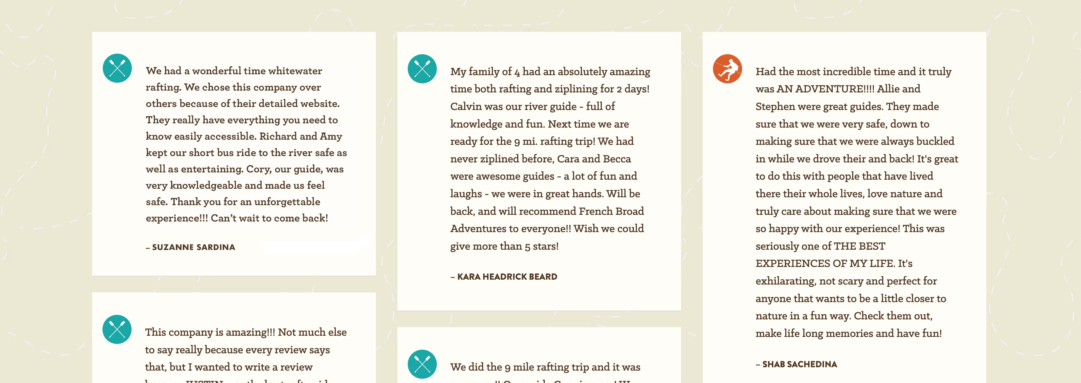
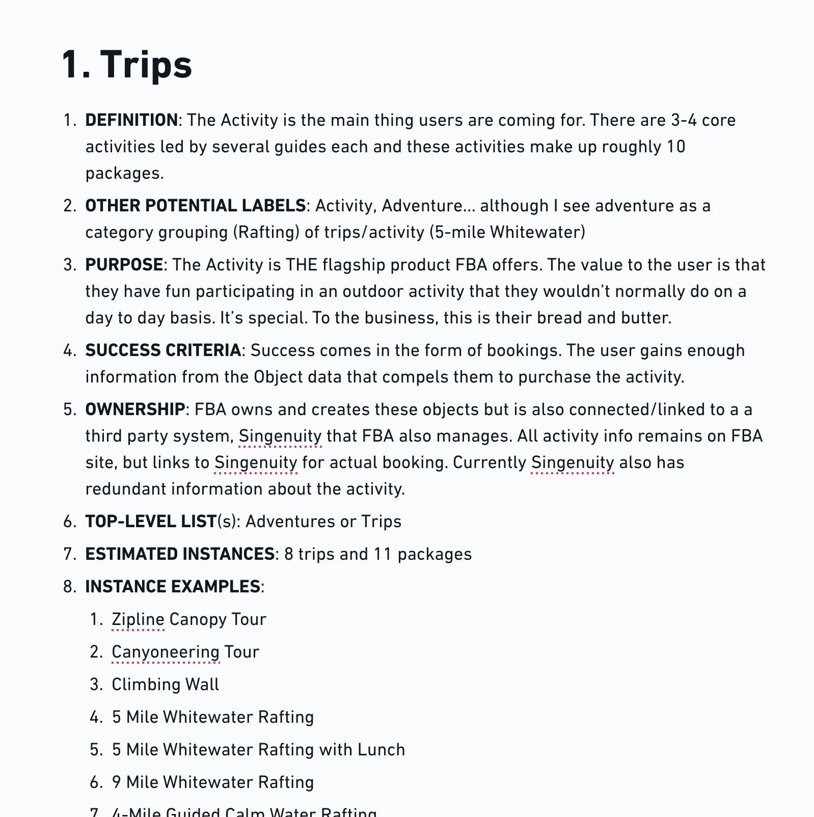
Research was performed using the current website content, user reviews, interviews, and analysis of industry peers. Object identification through noun foraging, and modeling of the relationships between these objects revealed that Trips, Activities, FAQs, Reviews and Locations are mainly what users are looking for (and once the service is launched, Courses). From there we were able to determine the attributes that make up the site's structured content, and finally the main calls-to-action throughout the website.
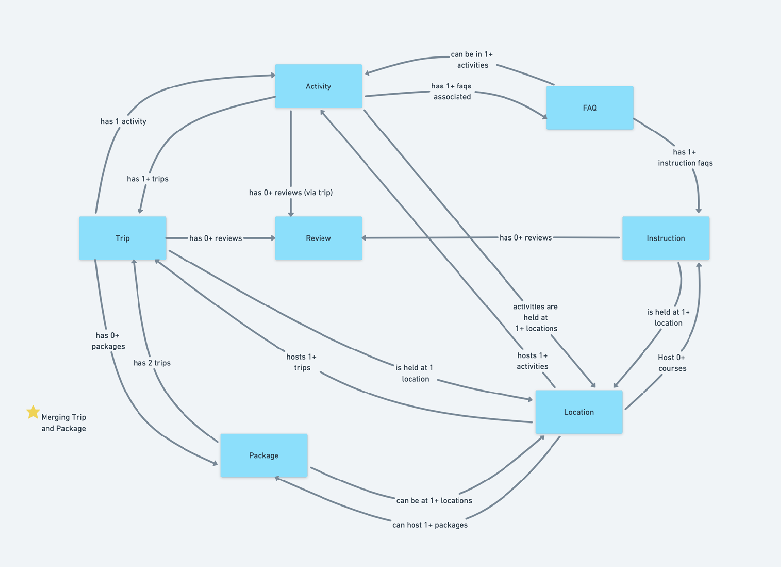
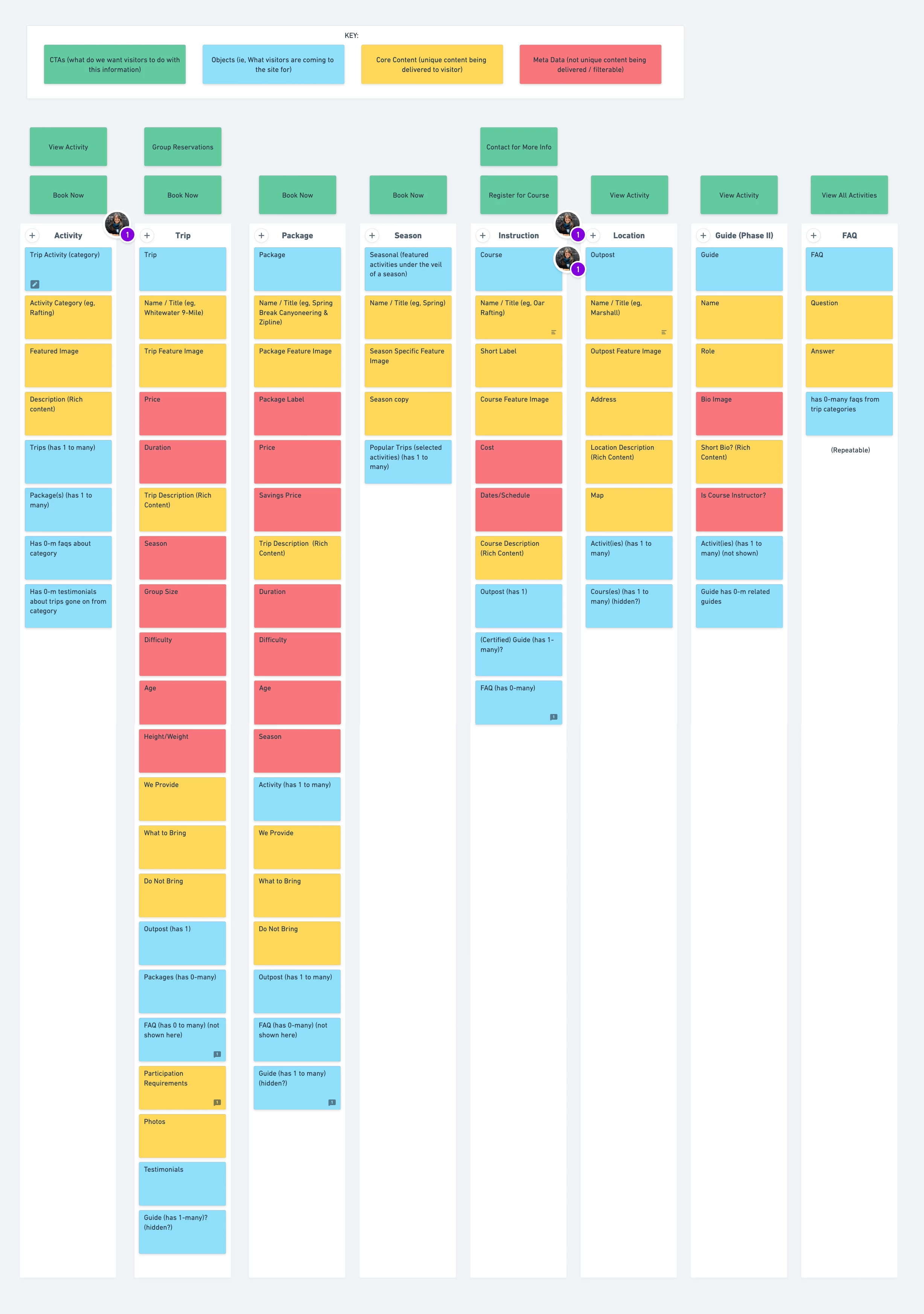
Documentation and prioritization of each attribute provided not only a road map for design, but also for development. A User Flow allowed for visualization of how each object is connected. In most areas of the website, there were no dead ends, keeping the users from getting lost and retaining their attention as long as possible.
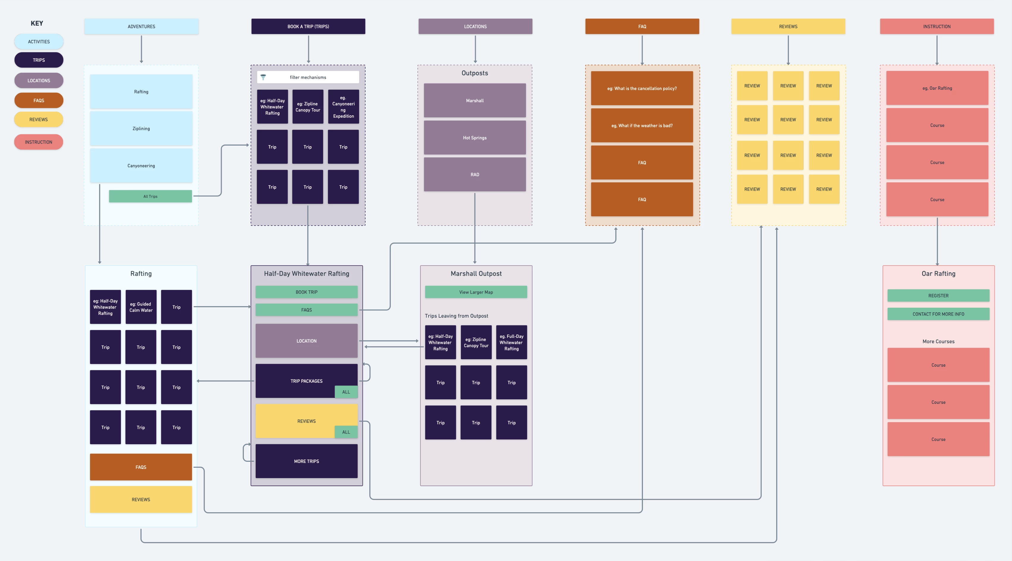
The OOUX process brought everyone on the same page before diving into the design and development phases of the project.
The Challenge
Our content audits revealed inconsistent and duplicate content, resulting in unnecessary client-side management. Our research found there was a lack of clear user flow for trip reservations, and prominent calls-to-actions took users to a third-party booking system too early. This often made it difficult to access critical information about an activity such as trip prerequisites, what to bring/wear, and where to meet. Addressing how and when website visitors accessed key information became a top priority.

Homepage
The Outcome
The improvements made to the user experience reduced confusion, prepares visitors, and streamlines bookings. Next phase will include bringing the third-party booking service directly into the FBA website for an even more optimal user experience.
Key areas of improvement:
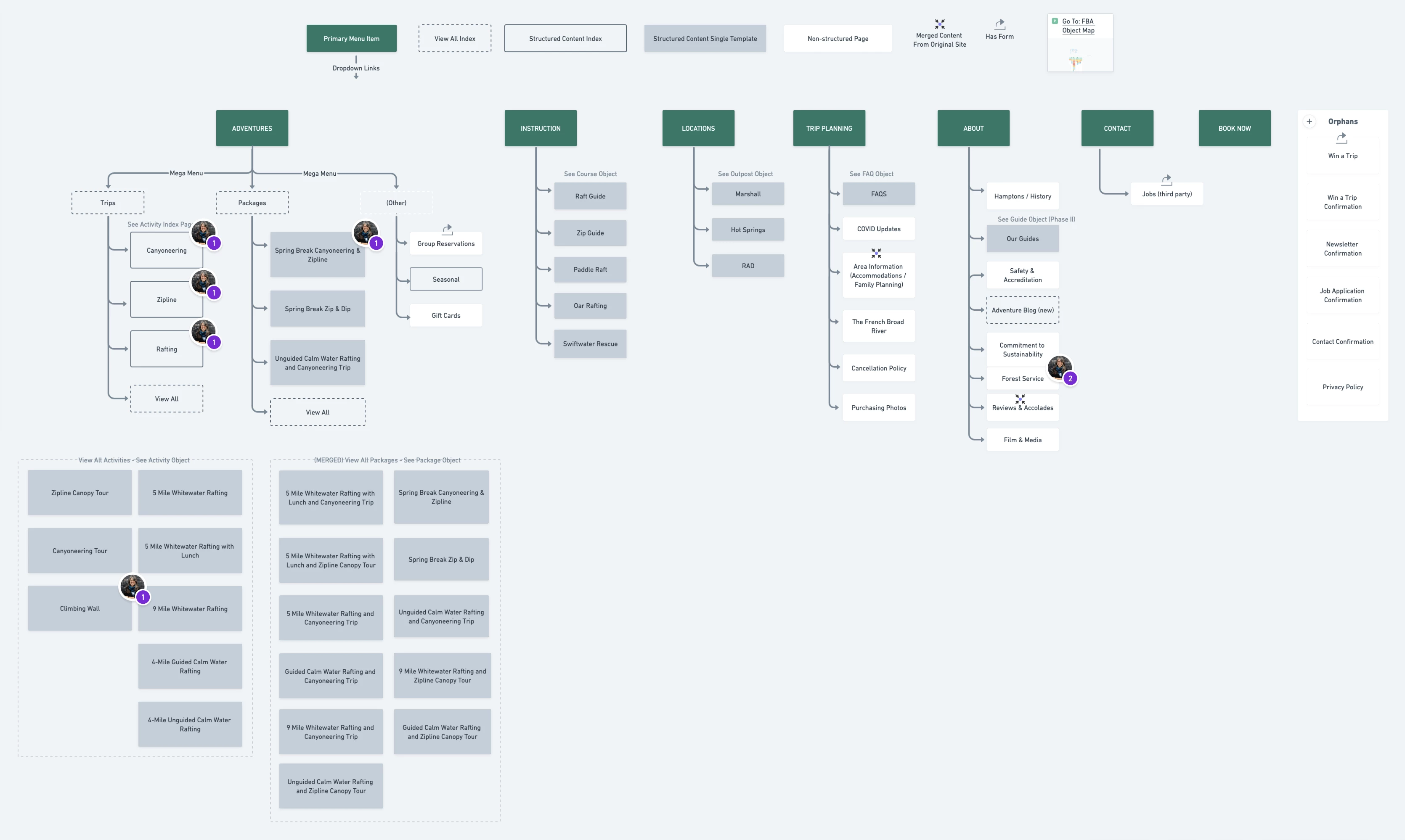
- Navigation menu for Adventures allows users to easily see the activity options, quickly find a package that interests them, gift cards, seasonal offerings, and or learn about reservations for large groups.
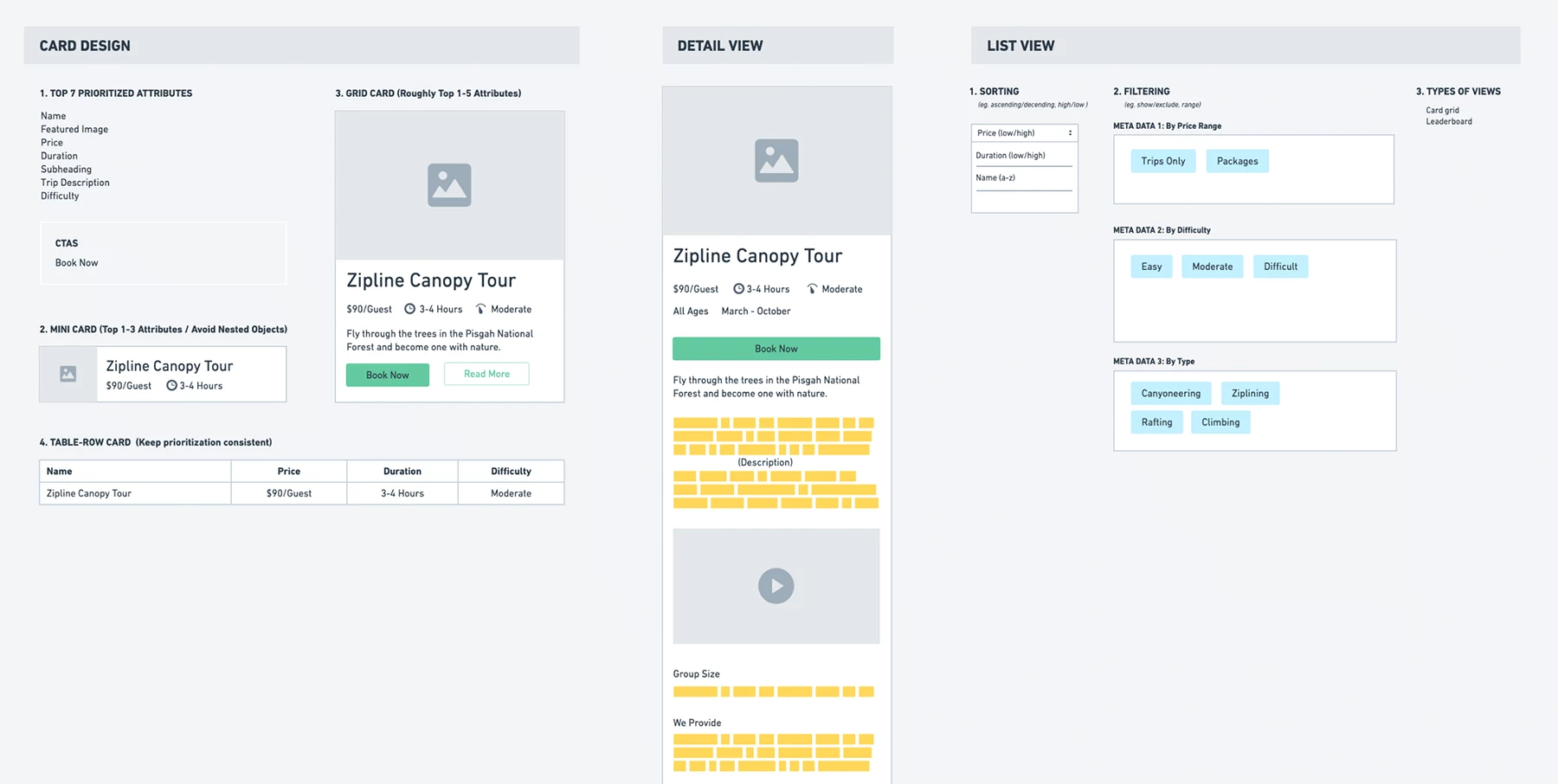
- Trip attributes were stored as filterable meta data so users can easily find a Trip that interests them.
- A Locations section allows us to make sure a Trip is mapped correctly to a meeting location and visitors can easily see where they need to show up. This was a common pain point as some locations are 40 minutes apart.
- Relevant FAQs now show up on the applicable Trip, but also on a main FAQs page so that staff can reference it quickly.
- Instruction courses are now available in the main navigation.
- With proper aria labeling, alt tagging and adjustments to brand colors, the website passes accessibility tests with zero errors or contrast issues.
- With 65% of visitors viewing with mobile, the use of the website on mobile is much easier and clear to use.
- Schema markup added to key areas of the site for greater search rankings and display.

Navigation menu


Trip detail pages

Group reservations call-to-action

Activity landing page in mobile view

Activity categories landing page

Packages index with filtering capability

Locations detail page now lists all trips leaving from that location

FAQs are available on activities pages


Course Instruction pages.