
Duke Health
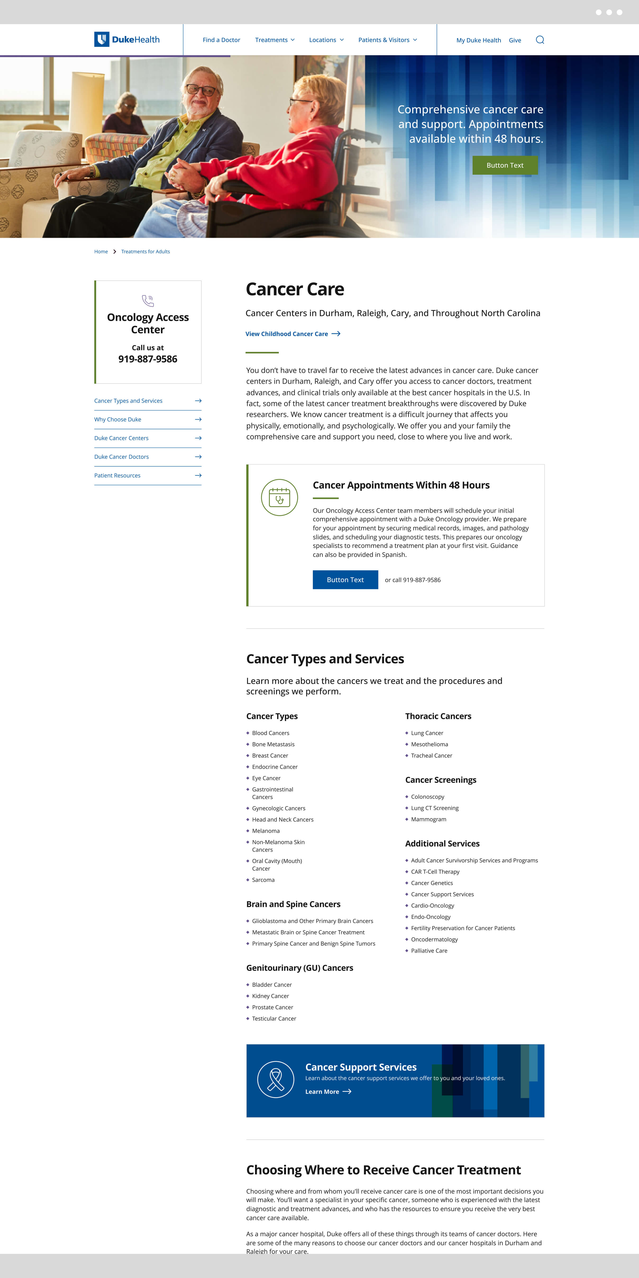
DukeHealth.org had retained the same overall look and feel since its launch in 2013. Despite countless meaningful updates over the years, the site was overdue for a visual overhaul. Rather than pursuing an expensive and time-consuming full redesign, the goal was to modernize the site's aesthetic through strategic, high-impact changes — primarily CSS updates — while refreshing photography and graphical elements. I collaborated with stakeholders to shape the visual direction and translate that into clear, actionable design decisions.
My involvement
UI Design & Visual Direction
Microinteraction Design
Typography Recommendations
Stakeholder Collaboration

Homepage
Outcome
A modernized, more refined DukeHealth.org that achieves meaningful visual impact without the cost or complexity of a ground-up rebuild.
Key areas:
- Redesigned the header and footer navigation to feel cleaner and more contemporary, incorporating gridlines and descriptive section headers, improving clarity and visual hierarchy across breakpoints.
- Lightened the overall visual tone of the site by reducing previously implemented heavy dark grays, removing the site-wide light gray background that had been framing content and CTAs, and introducing borders only where focus was needed.
- Made typography recommendations to replace the existing font with a more modern alternative that remained visually distinct while staying web-safe and on-brand.
- Designed and refined a suite of microinteractions including button styles and hover states, text link treatments, text highlight color, a progress bar applied across content pages, and a custom scrollbar; small details that collectively elevate the overall experience.
- Worked within CSS-scoped constraints throughout, ensuring all design decisions were grounded in what could be feasibly implemented without a full platform overhaul.
- Provided a style guide for their in-house development team to use while implementing new styles.

Site header and menu

Treatments and Locations Templates
View More Work


